Brand guidelines · version 2.0 · October 2026
Clear, light, and about getting better.
LapDelta Dash is the on-bike half of lapdelta.ai. Its brand is about insight and improvement: a white page, one teal, the lapdelta mark, and the delta trace that shows where a lap was won and lost. This page is the rulebook, with every asset you need to follow it.
1 · Foundation
What the brand stands for.
Purpose
Help riders improve by showing them what happened on a lap, while they ride and afterwards, in words they can act on.
Positioning
The race dash that is also the front door to lapdelta.ai: live delta on the bike, coaching off it, with no laptop and no file conversion in between.
Who it is for
Club racers and track-day riders who want to get better, run their own bikes, and are comfortable with tools but short of time.
Promise
Every lap, explained. The tagline, and the test for everything we make: does it help a rider understand a lap?
Personality
Clear
Plain words, real numbers, one idea at a time. If a rider has to decode it, we have not finished.
Encouraging
Like a good coach: points at the next gain, not the last mistake. Calm, never shouty.
Honest
Says what is proven and what is not. Built by someone who races; no hype.
Naming
| Product | LapDelta Dash: capital L and D, one word “LapDelta”, then “Dash”. Short form after first mention: “the dash”. |
|---|---|
| Company and service | lapdelta.ai in running text (lower case, with .ai) and LapDelta as the brand name. |
| Never | “Lap Delta”, “LAPDELTA”, “Lapdelta Dash”, “LD Dash” in public. No model numbers or number-based names. |
| Tagline | Every lap, explained. Sentence case, with the full stop, always. |
2 · Logo
The mark and the lockups.
The mark is the lapdelta A: a coral frame with a teal swoosh, the line through a corner. The lockup sets LapDelta in Sora Bold and Dash in Sora SemiBold teal. Use the supplied files; never rebuild the logo.
 Horizontal · the default
 Horizontal · on photos and dark panels
 Stacked
 Mark alone · when the name is nearby
 One colour · ink
 One colour · white
White is home. The full-colour logo is designed for white first; on a photo or a dark panel use the “dark” files, which turn the lettering white.
Clear space and size
Keep clear space around the logo equal to half the mark's height on every side. Nothing enters this area: text, edges, other logos.
| Minimum size, mark alone | 16 px on screen, 6 mm in print. |
|---|---|
| Minimum size, horizontal lockup | 120 px wide on screen, 30 mm in print. Below that, use the mark alone. |
| One colour | Ink or white only, for engraving, laser marking, single-colour print and embroidery. On the product itself the logo is white, one colour. |
Please don't
3 · Colour
White, ink, one teal.
White carries the page, ink carries the words, teal is the one brand colour. Coral lives inside the mark and nowhere else. Green and orange are data colours: they say ahead and behind, so they are never decoration.
- HEX
- #FFFFFF
- Use
- Page background
The ground of everything. Soft grey #F3F6F8 separates alternate sections.
- HEX
- #0E1A2B
- RGB
- 14 26 43
- Use
- Headings, key numbers
Body text is #334155; captions and labels #5B6676.
- HEX
- #00747A
- RGB
- 0 116 122
- Use
- Buttons, links, Dash
The working teal: white text on it, or it as text on white. One main action per view.
- HEX
- #00A0A8
- RGB
- 0 160 168
- Use
- The swoosh, graphics
For shapes, icons and the trace device. Not for text on white (3.2 : 1). Tint #E3F4F5 for highlights.
- HEX
- #F83848
- Use
- The mark only
The frame of the lapdelta A. Never a button, a headline, an accent or a background.
- HEX
- #000000
- Use
- The dash screen, the product
The screen background and the enclosure. Not a page colour: the web and print are white.
Balance
About 75 % white and soft grey, 17 % ink, 6 % teal, 2 % coral (the mark).
Data colours
| Ahead #12A150 · text #0F7A3D | Time gained against the reference lap; fills under the trace. | |
|---|---|---|
| Behind #E8770A · text #B45309 | Time lost against the reference lap. The same meaning as the dash's orange delta. |
These carry meaning. Do not use them for decoration, so that green and orange always mean what the rider thinks they mean.
Contrast (WCAG 2.2)
| Pairing | Ratio | Rule |
|---|---|---|
| Ink on white | 17.5 : 1 | Any text. |
| Body #334155 on white | 10.4 : 1 | Body text. |
| Muted #5B6676 on white / on soft grey | 5.8 / 5.4 : 1 | Captions and labels at any size. |
| White on teal #00747A | 5.6 : 1 | Button labels. |
| Teal #00747A on white | 5.6 : 1 | Links and small teal text. |
| Ahead text #0F7A3D / behind text #B45309 on white | 5.4 / 5.0 : 1 | Signed deltas in text. |
| Bright teal #00A0A8 on white | 3.2 : 1 | Not for text. Graphics and large shapes only. |
| Coral #F83848 on white | 3.7 : 1 | Not for text. The mark only. |
4 · Typography
Sora for headlines. Inter for everything else.
Two geometric sans faces, both free under the SIL Open Font License. Sora gives the headlines their friendly, confident shape; Inter does the reading and the numbers.
| Hierarchy | Eyebrow (Inter SemiBold, teal, with the small teal delta) → headline (Sora) → lead paragraph → body. |
|---|---|
| Case | Sentence case everywhere: headings, buttons, labels, eyebrows. No all-capitals text and no wide letter-spacing. |
| Print and documents | Same two families. Where they are unavailable, Arial for both. |
| Files | TTFs in the kit with the OFL texts. Web fonts are subset woff2 in /fonts. |
5 · The trace
Our one graphic device.
The delta trace is the picture of what the product does: a line that rises where a lap lost time and falls where it gained. Use it as the hero of a page, a divider, or a quiet background line.
| Decorative | One line, bright teal or its tint, round caps, on white. A light zero line is optional. |
|---|---|
| Carrying data | Ink line, orange fill above zero (behind), green below (ahead), signed labels. Real or clearly labelled as an illustration. |
| Never | A circuit map used as decoration, a countdown, or a big digital readout as a motif. |
The small teal triangle before each eyebrow is the delta, the only other mark-like detail. Do not use it larger than a capital letter.
6 · Keep it ours
Distinct from other dashes.
Other race dashes are sold to the same riders. People must be able to tell them apart at a glance, so we stay clear of the looks that belong to other products.
Ours
- White pages, ink text, one teal.
- Sora and Inter, sentence case.
- The lapdelta mark and the delta trace.
- Insight and coaching: what happened, and what to try next.
- The dash showing a real-looking lap: lap time, gear, live delta.
- Photos of the dash on real bikes.
Not ours
- Near-black “carbon” pages, carbon weave, grids behind everything.
- Red as an accent, or a red decimal point.
- Condensed all-capitals type with wide tracking.
- Tenths, decimal points or countdowns as the idea of the brand; number-based model names.
- A shift-light or shift-flash show as the hero; countdowns; a lap drawn round a circuit map.
7 · The dash screen
Designed to be read at speed.
The screen is the product, and its rules come from the design spec, not from the web brand. Show it as it really is.
| Ground | Pure black, 600 × 450. Black pixels are off on AMOLED: maximum contrast, less burn-in. |
|---|---|
| Numbers | The screen's own condensed numerals, tabular, white. Labels at half-grey so values dominate. This face belongs to the screen; it is not a brand typeface. |
| Layout | One hero value, optional gear beside it, one wide tile or two or three small tiles below. |
| Rev bar | 24 segments full width, 36 px tall, 4 px gaps. Green below 80 % of redline, amber from 80 %, red from 95 %. |
| Showing it | Screens on the site are illustrations drawn from the real layouts, replaying one believable example lap in real time with the firmware's own formatting (and the same lap the coaching example explains). They are labelled as illustrations, and the replay stays under the shift point: the story is the lap and the delta, not the shift light. Real photographs and video replace them as soon as there are good ones. |
Shift flash styles
Border (default). Bar goes white, 12 px red border.
Full screen. The whole background goes red.
Bar only. The rev bar flashes white, nothing else.
The shift flash is a safety signal on the screen. It is documented here, not used as marketing.
8 · Voice
Plain, exact, encouraging.
We write the way a good coach talks to a rider: say what happened, give the number, point at the next gain, and admit what is not done yet.
Say what is true
Describe what the dash does, in plain words, and only claim what has been measured. Nothing is “revolutionary”.
Use the number
“10 Hz GPS”, not “fast GPS”. “+0.18 s at turn 1”, not “a bit slow”. Units always written, deltas always signed.
Point forward
“This is where your next lap time is”, not “you got it wrong”. Short sentences, no lecture.
We say
- “Every lap, explained.”
- “It starts recording when you cross the line.”
- “The GPS sits inside the case: no pod, no extra cable.”
- “Final chicane +0.20 s.”
We don't say
- “Revolutionary, game-changing race technology.”
- “Win more races.”
- “Limited stock, order now!”
- “Military-grade.”
- “Seamless, effortless, cutting-edge.”
| Spelling and style | British English. Numbers as digits. “RPM”, “GPS”, “g” (lower case) for acceleration, “°C”. Lap times as 1:16.52 (hundredths, as on the dash); deltas with an explicit sign and unit (+0.17 s, −0.30 s). |
|---|---|
| Claims | Never claim a performance result (lap time gain, accuracy, durability) that hasn't been measured. Illustrations are labelled as illustrations. Never imply approval by a racing series or camera maker. |
| Third-party names | Camera and bike makers' names are used only to say what we work with, in plain text, never in their logos or styles. |
9 · Imagery
Real riding, real data.
Photography
The dash on real bikes, at real tracks, in the light of the day: the cockpit from the rider's seat, the paddock, the rider looking at a lap on a phone. Bright and documentary rather than moody. No stock models, no CGI bikes.
Product shots
On white or a light grey sweep for studio shots. The screen is always lit and showing believable data (a plausible lap, not 8888).
Charts and coaching
Lap compares, delta traces and coaching notes in the site's own type and data colours. Example data is labelled as an illustration.
Diagrams
Line art in ink on white, teal for the thing to look at, grey for the rest.
10 · Product and packaging
On the bike, in the box.
Rating plate
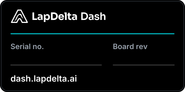
60 × 30 mm, for the black enclosure: black label, white one-colour lockup, a teal rule, serial and board revision written by hand or printed. The vector file is in the kit at 10 px per mm.

Round sticker
50 mm. White disc, teal ring, the mark and the name. For the helmet, the toolbox and the box.
| Enclosure | Black or dark grey ASA or PETG. The logo is laser-marked or printed in white, one colour; never coloured on the product. |
|---|---|
| Box and quick-start card | White, with the stacked lockup, a teal trace line and the tagline. Inside: a one-page card with the wiring in five steps. |
| Wiring and connectors | Label every lead plainly: Coil, GND, 12 V, Button. Wire colours are for function, not decoration. |
11 · Social and digital
The same, smaller.

Cover and sharing image
1500 × 500 cover and 1200 × 630 sharing image: the lockup on white with the tagline and a teal trace along the bottom. Rendered files are in the kit.


Avatar and icons
The mark on white: full-bleed square for avatars (platforms crop it to a circle), rounded square with a hairline for the favicon and the app icon.
| Addresses | dash.lapdelta.ai for the product site. Keep handles as close to “lapdeltadash” as each platform allows. |
|---|---|
| Buttons and links | Teal pill button with a white label for the one main action on a page; outlined button for the second. Links are teal, underlined. |
| Accessibility | All text meets the contrast table in section 3. Motion respects “reduce motion”. Every image has alt text, or is marked decorative. |
| Email signature | Name, role, the horizontal lockup at 160 px wide, then the tagline in grey. Nothing else. |
12 · Downloads
The brand kit.
Everything above in vector (SVG) and image (PNG) form, plus fonts and tokens for designers and developers.
Fonts: Sora and Inter, SIL Open Font License 1.1. The lapdelta mark is a lapdelta trademark: use it to refer to LapDelta Dash and lapdelta.ai, and follow this page.